Bring Historic Row Homes to Life with Color Choosing paint colors in a Washington, DC, row home can feel like a big decision. These homes have tall ceilings, detailed trim, and years of history built into every wall. The right colors can make that history feel warm and welcoming. The wrong ones can make rooms […]
Category: Color Schemes
Five Mistakes To Avoid When Choosing Paint Colors
Some would argue that there is no such thing as ‘right’ or ‘wrong’ when it comes to paint colors. They’d instead suggest that just as long as the respective buyer is happy, that’s all that matters. Unfortunately, this doesn’t make things any easier for those struggling to decide which way to go. Planning to give […]
Painting North-Facing Rooms

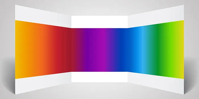
A space can be perfectly decorated and beautifully painted but if the chosen wall colors do not complement the natural light, based on the exposure of the room, the entire atmosphere might feel off a bit.
Natural light affects the way paint colors appear based not only on the location of the room but also on the season.
So what are the things to consider when choosing the best paint color? As professional painters we always take the time to consult and explore these choices with our clients.
2016 Benjamin Moore Paint Colors of the Year – Part II Pastels and Neutrals
In part II of this series we present Benjamin Moore 2016 color in neutral and pastel tones. These shades are frequently selected because of their ability to pair with interior items in a variety of colors. The paint colors below are soft, neutral and safe to use in any space without risking color clashing. In […]
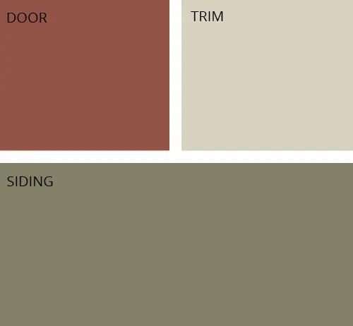
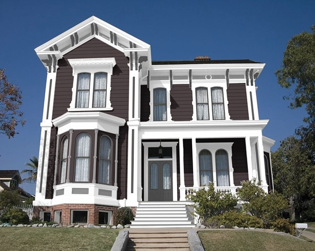
Inspiration: Exterior Home Color Combination
Paint Color Schemes – May
This month we figured instead of having just one color to put on display, we’d have five! Well, not really five colors, but rather, five color schemes! Spring is such a versatile time of year in the Washington DC area, that in order to encapsulate all of the lovely color changes that happen during the […]
Color of the month: Sherwin Williams Raisin
This month, we’re happy to introduce our newest color of the month, Sherwin Williams Raisin! As professional painters we make sure to only introduce you to colors that are sure to fit your aesthetic and style perfectly! Raisin is a great transition color between winter and spring. It’s darker undertones fit perfectly for those colder […]
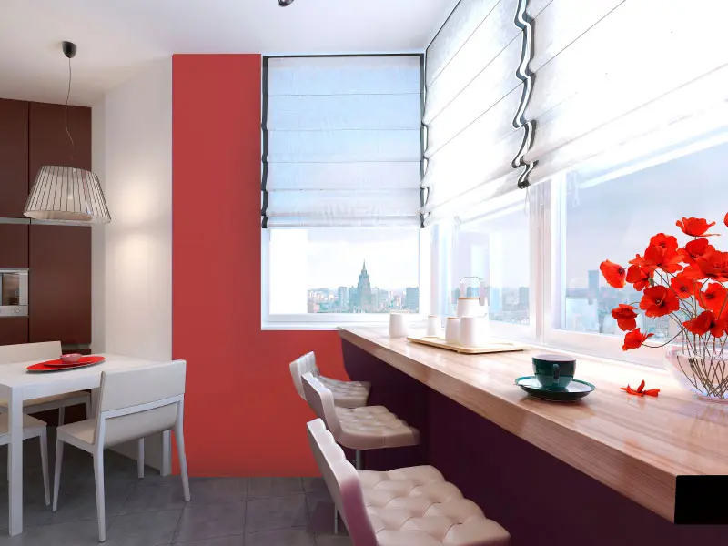
Color of the Month-Sherwin Williams’ Positive Red

If red is the color of love, than what better month to display the absolutely positively perfect Positive Red by Sherwin Williams? This is the type of red that adds that missing punch of color in an otherwise neutral color scheme, and truly brings design together. Positive Red work so well as a welcome on the […]
Pantone 2014 Aurora Red
Our last Pantone 2014 Fall color that we are profiling is the stunning but subtle Aurora Red, which allows seamless intergration and cohesion from exterior to interior. One of the best parts about living in the Washington D.C. area is the access to an abundance of fall foliage. If you want to bring that lovely […]
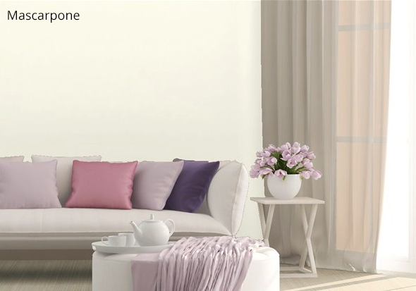
Pantone 2014 Mauve Mist
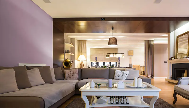
Every color palette needs a colorful neutral, and in Pantone’s Fall 2014 line-up that color is the delicate Mauve Mist. It has elements of lavender with beige and pink undertones, and it has a whimsical feel to it; much like Fall itself. Mauve Mist This color pairs so well with rich jewel tones and other […]