The biggest problem with interior painting at home is the fact that it comes across on the surface as a relatively simple job. After all, what could be easier than simply slapping a new coat of paint on the walls with a bunch of brushes? Unfortunately, it’s exactly this kind of underestimation that leads so […]
Category: Interior
How to Remove Wall Paper as Painlessly as Possible
It may have its upside, but there’s no disputing the fact that removing wallpaper can be a serious burden. What seems to be an easy job on the surface more often than not turns out to be anything but, once you get started. On the plus side, it doesn’t always have to be quite as awful an experience as it might be. Just as long as you know what you are doing and approach the job mindfully, you’ll get there in the end!
Decorative Painting 101

What’s the difference between standard painting and decorative painting? We’ll give you a clue – and it’s right there in the name! Of course, you could argue that all types of painting are decorative, given the way in which you’re looking to produce an attractive result. From homes to offices to commercial premises, we paint […]
New Study Sheds Light on How Paint Color Affects Property Values
These days, homeowners are taking no chances whatsoever when it comes to the value of their property. Up and down the United States, the fight to maximize property values has never been more intensive or more important. When the time comes to sell, there’s plenty that can be done to create the kind of image that resonates with buyers. But at the same time, if you haven’t made all the right moves when it comes to design and décor…well, there’s a pretty strong chance you won’t quite come out with the kind of perceived value you expected.
Cost to Paint Interior of a House
In our previous blog post, we wrote about the costs to paint exterior of a house. In this blog post, we will focus on the costs associated with painting interior of a house. To change the look and feel of the interior of the home, paint will easily do the trick. Painting the interior is […]
Painting North-Facing Rooms

A space can be perfectly decorated and beautifully painted but if the chosen wall colors do not complement the natural light, based on the exposure of the room, the entire atmosphere might feel off a bit.
Natural light affects the way paint colors appear based not only on the location of the room but also on the season.
So what are the things to consider when choosing the best paint color? As professional painters we always take the time to consult and explore these choices with our clients.
Project of the Month – textured ceiling removal
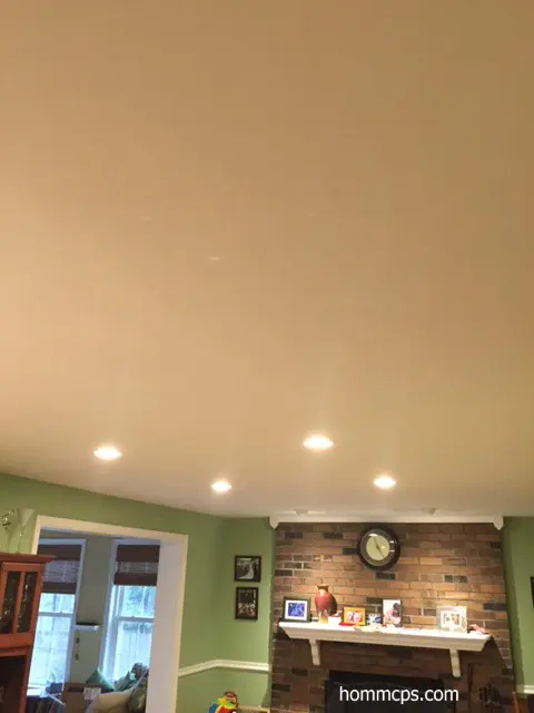
Description: In January we updated the ceiling surfaces in a home in Alexandria, VA. Textured ceilings are outdated and the customer had requested an updated look. The process involved thorough preparation, removal and painting of 1,500 sq ft of ceiling surfaces. The end result are smooth, freshly-painted ceilings in the entire house. Location: Alexandria, VA […]
2016 Benjamin Moore Paint Colors of the Year – Part II Pastels and Neutrals
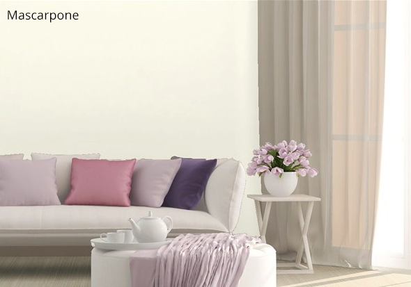
In part II of this series we present Benjamin Moore 2016 color in neutral and pastel tones. These shades are frequently selected because of their ability to pair with interior items in a variety of colors. The paint colors below are soft, neutral and safe to use in any space without risking color clashing. In […]
2016 Benjamin Moore Paint Colors of the Year – Part I Dark Tones
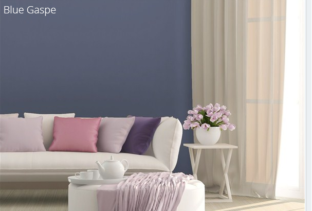
Benjamin Moore is a trusted paint brand that we consistently use for our professional painting projects and we are excited to present a series of colors that will be trending this year. In our first set of featured paint tones, we are revealing several of the dark as well as vibrant series of paint that […]
Wall paper removal and interior painting in Potomac, MD
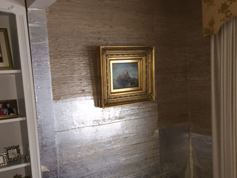
Our new featured project in Potomac, MD demonstrates an interior home improvement of wall paper removal and replacement with high-quality interior paint. Phase I of the project consisted of taking down the wallpaper which was 37 years old. Even though this process can be tricky, expensive and time consuming, we were able to complete the […]