Color Psychology – Color Choices for Interior Spaces
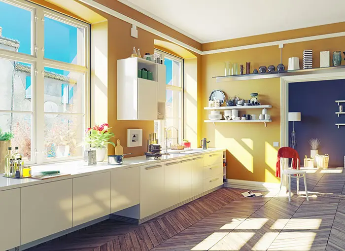
Image sources: Images in this post were found on Pinterest and Joy Tribout Interior Design
Ever wonder why some rooms have an immediate calming effect, while others seem to spark creativity? It may have to do with color selection! Color psychology is the idea that humans’ mood and emotions are affected by color. Here’s our guide to picking color for the perfect ambiance.
According to arttherapyblog.com purple is an equal mix of blue and red; both colors “provide a nice balance between stimulation and serenity that is supposed to encourage creativity”. This would be the ideal color for an office or children’s playroom.

Blue is a calming color that is said to “decrease respiration and lower blood pressure” which is ideal for a bedroom or a living room area.

According to Darling Magazine, green should be used in spaces “where you learn or read, or in places where calm and focus is needed”. A den with a library, or a nook in another area of the home is a place where green would be perfect.

Yellow is a color that is associated with food, and is supposed to increase metabolism. Use yellow as an accent color in a kitchen, like the picture below, so it does not become overwhelming to the space.

What rooms in your house need some color psychology? Have you ever been in a situation where you noticed a room color effect how you feel?
We are a locally owned company providing professional painting services for the residential and commercial clients. We have been in business since 2005 and we are still growing. We proudly serve the Northern Virginia and Maryland region.