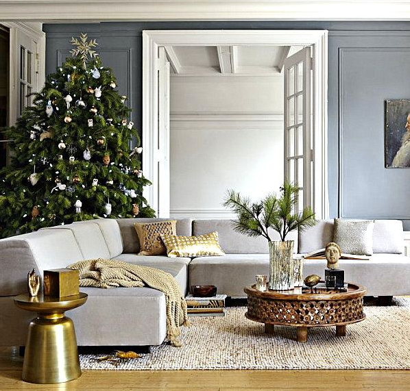
Interior Painting: Time to Walk Away from White?

It’s been proven time and time again that the color of the walls surrounding you at any time can have a big impact on your mood. Which in turn means that we have so much more control over the way we think and feel on a daily basis than most of us believe.
There’s a reason why everything from prisons to preschools are painted in very specific color palettes. It isn’t just to make them look pretty, or something that happens by accident – the colors you choose have a big impact on the overall mood and atmosphere of any interior space.
Of course, this isn’t to say that there’s anything fundamentally ‘wrong’ with white. Depending on your own personal taste and the room/property in question, white walls can look incredible and create a wonderful effect. Nevertheless, there’s also much to be said for thinking a little outside the box and experimenting with something slightly bolder.

Which could include the following:
Blue
First of all, rooms that are painted blue tend to be calming and relaxing. Contrary to popular belief, blue walls do not necessarily make for rooms that feel cold and uninviting. All you need to do is ensure that if you go ahead and paint your walls blue, you provide a sense of contrast with your chosen drapes and furniture – warmer tones making for a great color palette. Just be sure to be careful when it comes to any particular dark blues like navy, which can be a little on the gloomy side.
Yellow
Without question, yellow is just about the most energetic color you can choose for any interior living space. Studies have shown that when nurseries for example are painted yellow, children and babies naturally tend to be more energetic and fussy. Which is precisely why yellow kitchens look and feel so much more energetic and active than those painted other colors. Yellow can also make interior rooms look and feel bigger than they actually are.
Purple
If you want to go for a feeling of sophistication and wealth, a regal shade of purple could get the job done fantastically. It’s a great color choice for dining rooms and studies, not to mention the home office. Once again, it’s a case of being strategic with the exact hue you choose, ensuring you don’t go too far in terms of brightness of darkness. Eggplant representing a perfect middle ground, if you decide to go with purple. Interestingly, purple dining rooms have also been noted to significantly increase property values, for some unknown reason.
Orange
A little like yellow, orange interiors are all about energy, enthusiasm and general brightness. For obvious reasons therefore, not necessarily the best choice for a bedroom, but great for kitchens or kids’ play areas. There are also certain orange hues that can look simply outstanding when used in the bathroom. Think again about the various ways and means by which contrasts could be created.
Red
It’s known as the color of all things passionate and fiery, but is also known to be the kind of color that sparks conversation. Which is precisely why it is often used in restaurants, bars, clubs and other places where socializing is the order of the day. Whereas blues are all about relaxation and tranquillity, red has a habit of having the exact opposite effect. Just as long as you choose an appropriate hue, of course.
Green
Perhaps the best way of looking at greens as interior paint colors is a little like bringing a breath of fresh air indoors. Given the way in which greens are naturally associated with nature in general, they can be uniquely relaxing and borderline spiritual. It’s a little like bringing the indoors the taste of the outdoors, particularly when paired with other natural tones and hues like browns.
Grab Your Camera
Last but not least, every homeowner these days has the advantage of being able to experiment with as many colors as they wish, prior to actually going ahead and making a final selection. Simply grab your camera, take a few shots of the rooms you intend to paint and use simple image editing software to see what they would look like in a variety of colors. This way, there’s no need for costly experimentation with the actual paint itself, or living to regret choosing a wholly inappropriate color palette.


