How to Coordinate Paint Colors with Your Decor
In the world of interior design, the perfect color palette can transform a space from ordinary to extraordinary. The art of color coordination goes beyond selecting a pleasing hue for your walls; it involves harmonizing paint colors with existing furniture, decor, and overall design themes. In this article, we explore the tips and tricks to master the delicate balance of color, creating a cohesive and visually stunning home.
Start with a Vision
Before diving into the world of paint swatches, take a moment to envision the overall look and feel you want for your space. Consider the mood you want to evoke – whether it’s a serene retreat, a vibrant gathering place, or a cozy haven. Having a clear vision will guide your color choices and help create a cohesive design scheme.
Consider the Existing Decor
Take stock of your existing furniture, decor, and textiles. Identify the dominant colors and patterns in the room and use them as a starting point. If you have a statement piece of furniture or artwork, consider pulling colors from it to inform your paint choices. This approach ensures that your paint colors complement rather than clash with the existing elements in the room.
Understand Color Psychology
Colors have the power to influence our mood and perception of a space. Understanding color psychology can guide your choices in creating the desired atmosphere. For example, blues and greens are often associated with tranquility, making them ideal for bedrooms and bathrooms. Warm tones like reds and yellows can add energy to social spaces like the living room or kitchen. Consider the emotional impact you want each room to have and select colors accordingly.
Create a Cohesive Flow
For an open floor plan or interconnected rooms, maintaining a cohesive flow is essential. Choose a neutral base color that can serve as a backdrop throughout the space. This neutral acts as a unifying element, allowing for the introduction of accent colors in individual areas. This approach ensures a seamless transition from one room to the next, creating a visually pleasing and harmonious environment.
Use the 60-30-10 Rule
A tried-and-true rule in interior design is the 60-30-10 rule. This formula dictates that 60% of the room should be a dominant color, 30% a secondary color, and 10% an accent color. Apply this principle to your walls, furniture, and accessories to achieve a balanced and visually appealing composition. The dominant color sets the tone for the room, the secondary color adds visual interest, and the accent color provides a pop of personality.
Test Paint Samples
Never underestimate the power of paint samples. Lighting conditions and the surrounding environment can significantly influence how a color appears. Before committing to a full room, test your selected paint colors on a small section of the wall. Observe how they look at different times of the day and under various lighting conditions. This hands-on approach allows you to make informed decisions and ensures that the final result aligns with your vision.
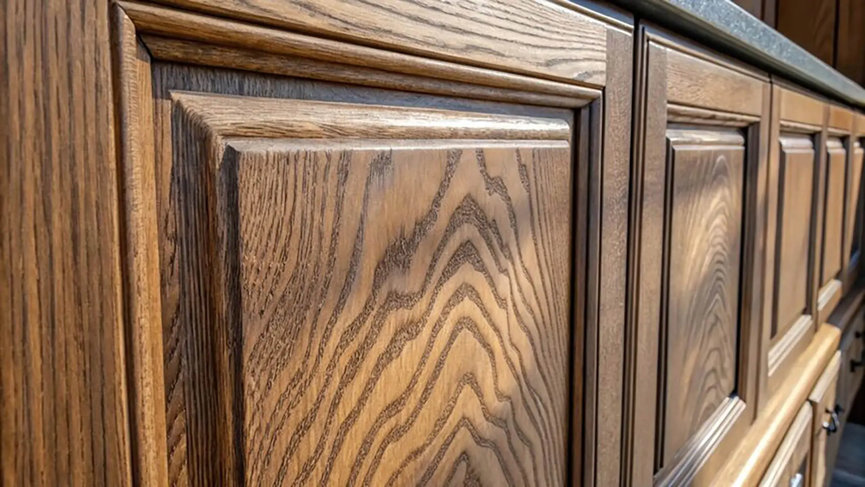
Coordinate with Wood Finishes
If your space features wooden furniture or flooring, consider how your paint colors will coordinate with these finishes. The undertones of wood can clash or complement certain paint colors. For warm-toned woods like oak, consider earthy hues like warm beige or olive green. For cooler-toned woods like walnut, opt for cool neutrals or shades of blue. This coordination ensures a seamless integration of all elements in the room.
Balance Bold and Neutral
If you’re drawn to bold and vibrant colors, balance is key. While a bold accent wall or colorful furniture can add personality to a space, pairing it with neutral tones prevents overwhelming the room. Neutral colors like whites, grays, and beiges provide a calming backdrop, allowing bold elements to shine without creating visual chaos.
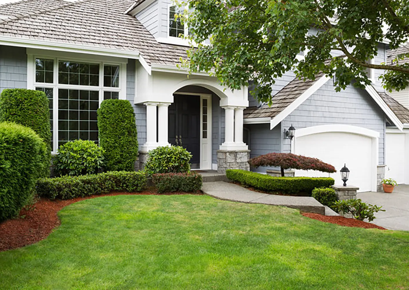
Consider the Size of the Space
The size of a room can influence the perceived color. In smaller spaces, light and neutral colors can create an illusion of openness and airiness. Darker colors, on the other hand, can add coziness and intimacy to larger rooms. Tailor your color choices to enhance the size and proportions of each space, creating a harmonious balance between color and scale.
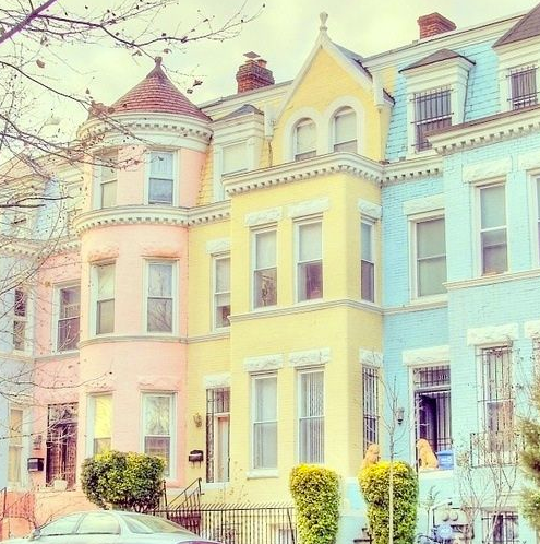
Embrace Trends with Caution
While it’s tempting to incorporate the latest color trends into your home, do so with caution. Trends come and go, and what’s fashionable today might feel dated tomorrow. If you’re drawn to trendy colors, consider incorporating them through easily changeable elements like accessories, pillows, or artwork. This way, you can refresh your space without a complete overhaul when trends evolve.
Conclusion
Mastering the art of color coordination is a transformative journey that elevates your home from a collection of rooms to a harmonious and visually stunning haven. By starting with a clear vision, considering existing decor, understanding color psychology, and employing design principles like the 60-30-10 rule, you can create a space that reflects your style and enhances your well-being. The seamless coordination of paint with decor is not just about aesthetics; it’s about crafting an environment that feels like a true reflection of you. So, grab your paintbrush and embark on the exciting adventure of turning your vision into a colorful reality.
For more information on the services we provide or to discuss your requirements in more detail, contact a member of the team at Homm CPS today.