How to Choose a Paint For Your House
Here’s a question – why do some home paint jobs look ancient after three years, while some carried out while Clinton was in office are still 100% flawless? Technique? Care and maintenance? The materials being painted?
The answer is actually none of the above – it’s all about the quality of the paint that is used for your house painting project!
In this blog post we will talk about different paints that can be used for your exterior or interior house painting project and how to choose a paint that gives you the best value for your money.
Choosing the Right Paint
It’s probably fair to say that making any sense whatsoever of the home paint aisle can be a daunting prospect to say the least. Contrary to popular belief, choosing by price alone isn’t necessarily the best way to go. Just as certain paints that are $60+ per gallon will let you down, others that are more in the region of $30 per gallon can be surprisingly effective.
Instead therefore, it’s a case of taking into account what actually matters – all of which comes long before those all-important color considerations. If you are planning to buy from a reputable brand, it is usually safe to say that their premium line will almost always offer better coverage and longer lasting results than their budget lines.
It’s worth bearing in mind that one of the biggest investments whatsoever when it comes to interior and exterior home painting alike is that of labor. Which in turn means that if there is a product available that gets the job done quicker and offers you a long lasting result, it simply makes sense in terms of both effort and value for money to go for premium paint.
Paint Pigments
One of the other ways of assessing the quality of paint is by taking a note of pigments. Generally speaking, the higher the pigment quality, the better the coverage in one coat and therefore the easier job and the further you will get with each can of paint. Lower-cost pigments result in low-cost paints, but also the kinds of paints that make it necessary to use any number of coats to get the job done – not the most cost-effective decision. Most experts agree that titanium dioxide is the best pigment to look out for, so be sure to look at the list of ingredients.
Paint Solids
It’s also worth looking at the percentage of solids listed, which basically means how much of what you apply to your home stays there after the liquid itself has dried. If it has a solids percentage of 45% or more, this is usually considered good. Emerald Exterior paint from Sherwin Williams contains 53 percent solids by weight, for example. The only problem being that quite a lot of paint manufacturers do not have the necessary information on their products, so you will have to ask the retailer directly for more information.
2016 Paint Color Trends
As for picking those colors, forecasters for 2016 pretty much got everything right on the money once again. Some of the country’s most reputable names in home paint production have singled out their own top picks and favorites, which are guaranteed to look just as incredible years down the line as they do right now.
Consider trying out any of the following and you will find it difficult to go wrong:
1. Benjamin Moore: Simply White

As far as the folks at the Benjamin Moore Color Studio are concerned, white absolutely deserves recognition as a color trend for 2016. But we are not talking the usual brilliant white emulsion with a rather sterile feel, but rather a wide variety of new shades of white that are far more polarizing and powerful. They recommend their own Simply White OC-117, which is nothing short of stunning.
2. Valspar: Simply Perfect Palette
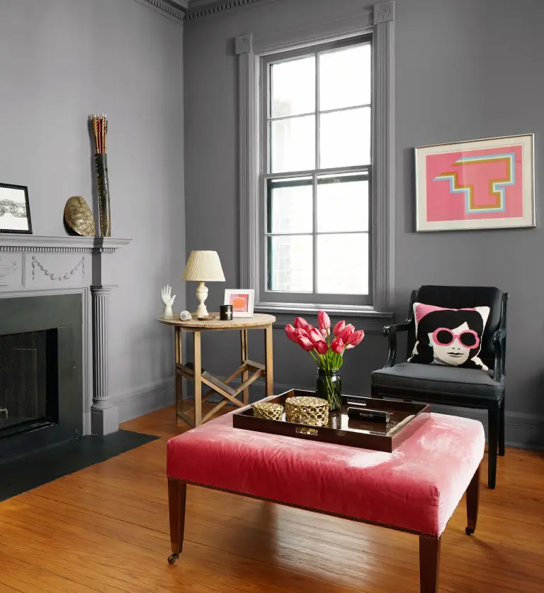
These guys are more about focusing on color palettes, as opposed to singular colors of prowess in 2016. In the case of their Simply Perfect Palette, it’s a beautifully simple case of marrying predominant greys with the occasional pop of bright color that really sets any room alight. Like many, they believe grey to be the shade of the decade.
3. Colorhouse: GLASS .02
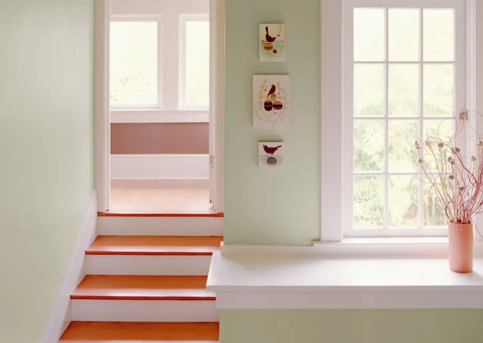
Grey once again but with a distinct green hue, the folks at Colorhouse have hedged their bets on the kinds of colors that do a spectacular job framing furniture, items and accessories made with natural leather, metal, wood and largely anything upcycled or roughhewn.
4. Kelly-Moore Paints: Horizon Gray

The grey theme continues with Horizon Gray KM4858, which was chosen by Kelly-Moore Paints as a 2016 trend in its own right. They believe this to be the year when calmer, softer colors take the place of the high chroma colors of years gone by – particularly in living rooms and bedrooms.
5. Glidden: Cappuccino White

A gorgeous alternative to flatter whites and particularly well suited to modern kitchens and bright living spaces, Cappuccino White (45YY 74/073) has the kind of versatility that makes it an absolute winner for 2016.
6. Olympic: Blue Cloud
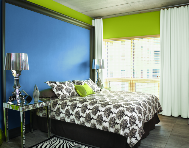
Bold, brash and undeniably beautiful, Blue Cloud (D48-5) is less reminiscent of the sky itself and actually looks more like the deep blue ocean on a sunny day. More of a color to be used in conjunction with neutral tones to prevent it becoming overpowering, Blue Cloud is nonetheless an absolutely stunning shade.
7. PPG: Paradise Found
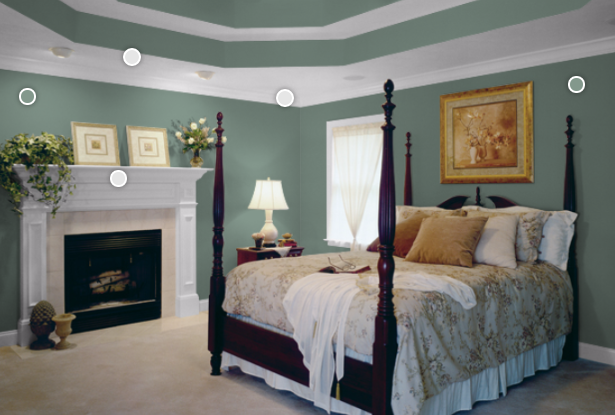
Last but not least, the idea of choosing colors that beautifully frame natural furniture, fixtures, ornaments and environments in general continues with Paradise Found (PPG1135-5). A catching yet understated green that would be just as home in a variety of exterior living spaces as out on the patio.
If you need help with a house painting project or professional paint color consultation, please get in touch with us for a free estimate.
